
The Best of Graphic Design in Post-war West Germany
- Gen de Art
- Apr 8
- 4 min read
“…just work, and while I note, I see these two words unfolding on paper, growing to about 150 points in a beautiful and bold arrangement.”
-Hans Hillmann (https://www.grapheine.com/en/history-of-graphic-design/hans-hillman-affiche-sans-cinema>)

Wolfgang Schmidt, Exhibition, bauhaus idea form purpose time, 1964, poster, A5 collection Düsseldorf
In the world of art and design, the Bauhaus (1919-1933) played a tremendously essential role in cultivating design principles and training the most highly acclaimed architects, designers and craftsmen in history. The German art school was then, succeeded by the Ulm School of Design in 1953. Such was the progressive indulgence in design theory and practice in West Germany that by the late 1950s, the country’s economic boom instigated the swift growth of graphic design, in particular.
Tokyo Metropolitan Teien Art Museum is showcasing the evolution of graphic design in post-war West Germany in “Back to Modern-Graphic Design from West Germany” until May 18th this year. The comprehensive exhibition highlights around 130 posters and 250 documents, including booklets and magazines that clearly evaluate the significant impact of German design. For the first time, the A5 Collection Düsseldorf in Japan, formed by graphic designers Jens Müller and Katharina Sussek based in Düsseldorf, is introduced. This collection has expanded to over 1,000 posters, thus, has been a vital source of reference in investigating the movement of graphic design from post-war Germany up to its reunification in 1990.

Dieter von Andrian, Exhibition, German Traffic Fair Munich 1953, 1953, poster, A5 collection Düsseldorf
©Heiresses of Dieter von Andrian
Posters served as crucial windows of communication in Germany during and after both World Wars I and II when a flux of political propaganda dispersed throughout the troubled nation, more so with the rise of the Nazi regime in the 1930s. Messages spoke of opposition to communism and the fight for German reintegration.
On another side, some designers focused on more cultural and artistic promotion. Product design escalated in the late 1950s, ushering in illustrations advertising Porsche, Mercedes-Benz, Volkswagen, BMW, Leica, Braun, Lamy, Adidas, Puma, and Rimowa, among distinguished brands.
One of the most important national and global events in the latter half of the 20th century was the Munich Summer Olympics of 1972. Remembered both with glory and tragedy due to the terrorist attack resulting to seventeen deaths, the Olympic posters seen in the exhibition remain today as relics of historical drama. Graphic designer and typographer Otl Aicher (1922-1991) conceived of pictograms for sports events and venues, and a mascot Waldi, the dachshund. Pastel colors were chosen to distinguish the ambiance from the 1936 Berlin Olympics during the Nazi era.
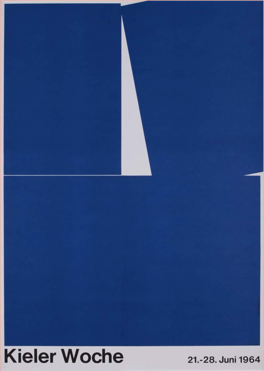
Another celebrated sports event held in Germany that launched a poster design competition was the Kieler Woche, world’s largest sailing festival. Located in the northern region, Kiel has been hosting the prestigious event since its regatta in 1882. The name Kieler Woche emerged in 1894, and the first design competition took place in 1950. Graphic designer Hans Hillmann’s (1925-2014) Kiel Week 1964 (1964) poster is deduced to a singular color blue with the prominent white sail as main focus.


Hans Hillmann, Film, Seven Samurai, 1962, poster, A5 collection Düsseldorf ©Marlies Rosa-Hillmann
Hans Hillmann, Kiel Week 1964, 1964, poster, A5 collection Düsseldorf ©Marlies Rosa-Hillmann
Between 1954 to 1974, Hillmann designed about 150 posters for some of the best acclaimed films in history by Alfred Hitchcock, Sergio Leone, Orson Welles, Luis Buñuel, Pier Paolo Pasolini, Akira Kurosawa, and others. Shown in the exhibition is his interpretation of Kurosawa’s Seven Samurai (1962), a modernly stylized art in primary colors. In Jean-Luc Godard’s Weekend (1969), no human figures or scenarios appear on the design, except for trembling white text on black background to insinuate a disturbing weekend.
Typography, specially highlighted in the exhibition, was one of German design’s strong assets during this era. International communication expanded after World War I, and triggered the consequential need for universal typeface designs. This potent drive for uniform printed typefaces and black letter types were particularly evident during the Nazi reign. The emboldened style suited the identifiable German national script, which was widely used on official documents as well.
After World War II, the International Typographic Style, which was formerly established in the 1920s in Russia, Netherlands, and Germany, swept across Switzerland as well. It included plain Sans Serif fonts like Helvetica. In West Germany, type designer and calligrapher Hermann Zapf (1918-2015) designed Palatino, Melior, and Optima fonts. Bauhaus emphasized simple, practical and sufficiently legible fonts that functioned for clear communication. On display, the poster for the 1964 exhibition Bauhaus Idea/Form/Purpose/Time in Frankfurt by typography master Wolfgang Schmidt (1929-1995) gives a strong, bold typeface impression that required no further embellishment. Also by Schmidt, the poster for the movie Capers (1963) suggests a play of moving typeface accented in red over the central black and white image.

Wolfgang Schmidt, Film, Capers, 1963, poster, A5 collection Düsseldorf

Installation view, Back to Modern-Graphic Design from West Germany, Tokyo Metropolitan Teien Art Museum, Photo: Alma Reyes
The installation layout at the annex building of the museum is wonderfully curated in vibrant red, blue, and white walls and partitions that articulates the diverse collection of graphic designs. The label “Made in Germany” became a powerful statement after World War II signifying advanced industrialization in the country, and the development of high-quality products guided by precision, durability and reliability. Simultaneously, the designs emitted geometric abstraction that pervaded in the 1920s, with the likes of Wassily Kandinsky, Piet Mondrian, Josef Albers, László Moholy-Nagy, and other abstract artists. The concept conjured geometric shapes, clear-cut rhythms and balanced composition. A huge array of exhibits reflect this tendency, from Willy Fleckhaus’ twen, 10.1959/Magazine (1959), Dieter von Andrian’s Exhibition, German Traffic Fair Munich 1953 (1953) to Heinz Schwabe’s Commercial Graphics, 11.1953/Magazine (1953).
Film posters and magazine covers combined illustrations and photography, which spread rapidly after World War II. Designers turned to innovative techniques, such as photomontage, collage, image blurring, and photo cropping. The popularity of Hollywood cinema also shed great impact, seen as distractive entertainment away from dark shadows of the war. Visitors will enjoy the parade of memorabilia of notable movies, celebrities, singers and pop icons, such as the Beatles, Marilyn Monroe, Yves Montand, the Italian film L’Amore by Roberto Rossellini, and more.
Back to Modern-Graphic Design from West Germany
Dates: Until May 18, 2025
Location: Tokyo Metropolitan Teien Art Museum
Opening hours: 10 am – 6 pm (Last admission 5:30 pm)
Closed: Mondays (except May 5), May 7
Written by Alma Reyes
